
Culture
Graphic tee colour combinations that change the mood
Explore graphic tee colour combinations through background, print contrast and outfit choices, with practical ways to judge what works for you.
In this story
Start with a simple question: do you want people to notice the graphic first, or take in the whole outfit? The answer helps you judge a tee’s colour more usefully than a rule about which shades supposedly mean confidence, calm or rebellion. A print has edges, lettering and spaces between its elements. The garment underneath gives all of those things a setting.
The Fashion Institute of Technology’s event listing dates *Picturing Color: Artists Reveal the Spectrum* to 12 November–8 December 2026 at its Art and Design Gallery. Bringing together fine artists, photographers, graphic designers and textile designers, the exhibition explores emotional responses to colour and the way meanings vary across cultural contexts. That provides a useful starting point for our own clothing question: how can the same graphic feel different when its surroundings change?
1. Start with the idea in the graphic
Before comparing colours, decide what you want to come through in the artwork. Is it a phrase someone should be able to read? A shape you like from a distance? A reference whose meaning only becomes clear up close? Those are different priorities. A combination that gives lettering immediate clarity may feel more insistent than one that lets the message settle into the garment.
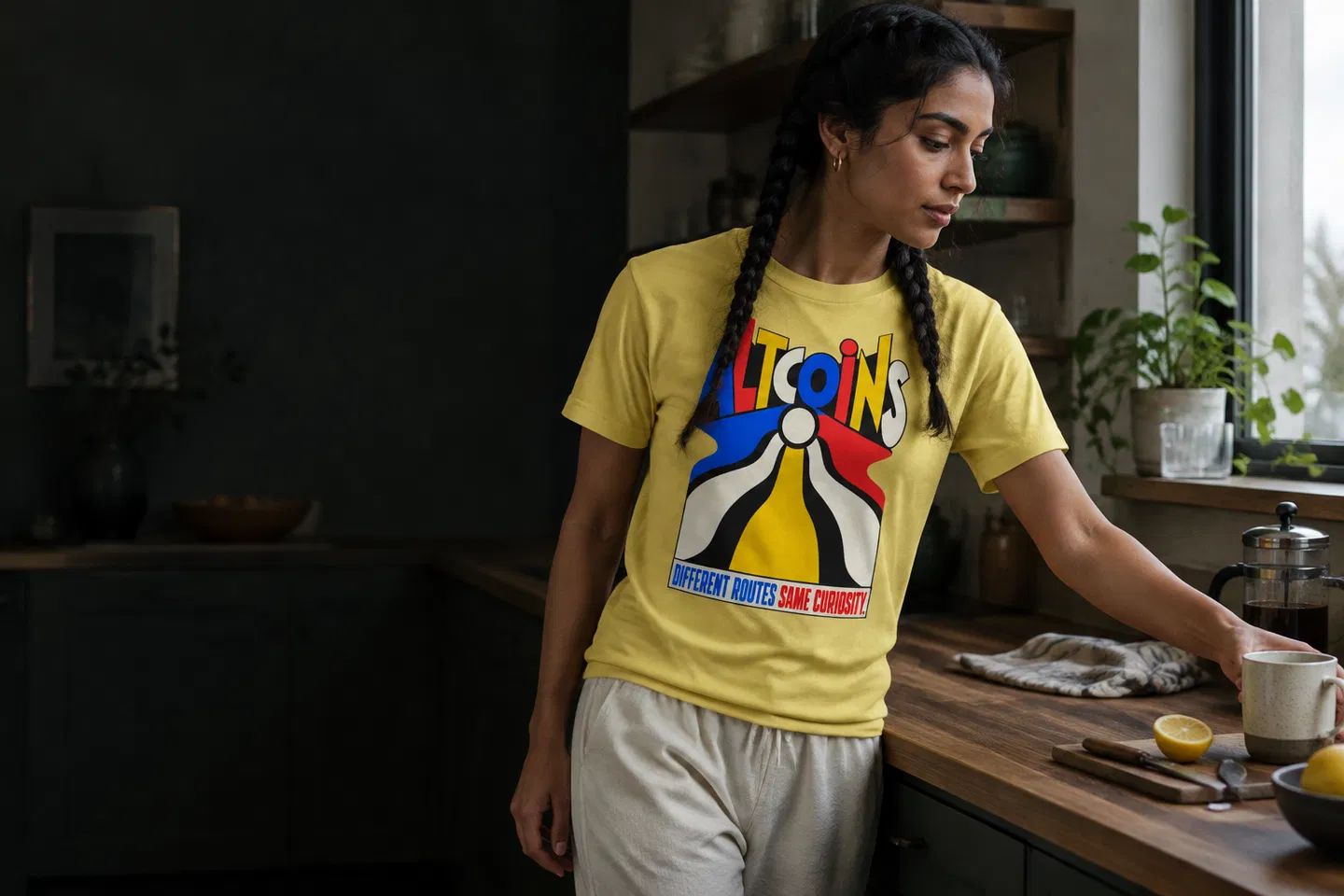
Consider the wording of ALTCOINS — DIFFERENT ROUTES SAME CURIOSITY. The title places curiosity alongside the idea of different routes. Our editorial reading is that the phrase leaves room for an exploratory attitude towards crypto culture. When considering this tee, start by asking how prominently you want that message to feature in your outfit, then judge the product imagery against that intention.
The Bitcoin Where Your Net Worth Changes in Milliseconds V-neck T-shirt offers another starting point through its title: speed and abrupt change. You might want that reference to feel conspicuous, or prefer it as a detail within an otherwise restrained outfit. Neither choice requires treating the words as financial guidance. Here, they are part of the clothing’s cultural vocabulary.
2. Read the garment as a background
A graphic tee gives its artwork a background that moves with the wearer. The area around the print matters, including the space above it, beside it and beneath it. Before concentrating on small details, look at the garment as one broad shape. Ask whether the background catches your attention on its own or mainly helps define the artwork.
Imagine a simple pale graphic placed first on a dark background, then on a pale one. This is a hypothetical comparison, rather than a claim about colour options for either tee. On the dark ground, the graphic’s boundary would generally be easier to distinguish. On the pale ground, its visibility would depend more heavily on outlines, differences in hue and any darker details within the artwork.
That distinction helps explain why a background cannot be chosen in isolation. A colour you enjoy as a large block may obscure the part of a print you most want to see. Equally, a background you would usually overlook might give a favourite graphic exactly the degree of definition you prefer. Judge the relationship before judging either colour separately.
3. Separate contrast from brightness

A bright garment does not automatically make its print clear. Brightness and contrast answer different questions. One concerns how much a colour attracts your attention; the other concerns how readily you can distinguish adjacent areas. A strongly coloured tee can carry a print that blends into it, while a quieter-looking garment can give its lettering very distinct edges.
For a practical comparison, picture dark blue lettering on black and the same lettering on cream. The blue has not changed, yet its visibility would change substantially. Now imagine two vivid colours of similar lightness sitting together. Their hues might be easy to tell apart at close range, while small lettering could still take effort to read. Colour difference alone does not guarantee legibility.
When looking at a product image, step back from the screen before enlarging it. Notice what remains recognisable at that smaller scale. Then move closer and inspect the details that disappeared. This gives you two useful readings: how the tee might register across a room, and what it might reward someone with nearby. Neither needs to win, but knowing your preference makes the choice less arbitrary.
4. Check which details survive
Once you have assessed the broad contrast, look at the smallest meaningful parts of the artwork. These might include a letter’s enclosed space, a narrow gap between shapes or a fine boundary. A combination can make the overall graphic visible while leaving those details less distinct. If the appeal lies in reading a phrase, that difference deserves attention.
For a tee chosen because of its wording, try reading the message without leaning towards the screen. Then inspect it at a larger size. You are checking whether the product photograph gives you enough information to make a considered choice, rather than predicting exactly how every detail will look in person. A screen image remains a representation of the garment.
For artwork you enjoy mainly as a composition, immediate readability may matter less. You might prefer the print to resolve gradually as someone approaches. That is a personal styling preference, not a defect to be corrected. The useful question is whether the combination preserves what you value about the design, rather than whether it produces the strongest possible contrast everywhere.
5. Give the tee an outfit context
The next background is the outfit itself. A jacket introduces a border around the chest; trousers create a larger neighbouring colour below it. Even when the tee stays unchanged, those surrounding areas can alter how prominent it feels. This is where a comparison becomes more useful than a list of supposedly perfect colour pairings.
As a styling exercise, try a graphic tee with dark trousers and an open overshirt in a similarly subdued colour. The surrounding clothes may leave the visible print as the main point of attention. Then picture the same tee with trousers in a more conspicuous colour. Your eye now has another substantial area to consider. That can be enjoyable, provided you like the balance rather than expecting the graphic to remain the sole focus.
You can also pick up one visible print colour elsewhere in the outfit, perhaps through socks or a bag you already own. Keep the echo small if you want the tee to lead. There is no need to reproduce every shade. A single connection can make the combination feel deliberate while leaving the artwork enough independence to remain interesting.
6. Compare combinations under similar conditions
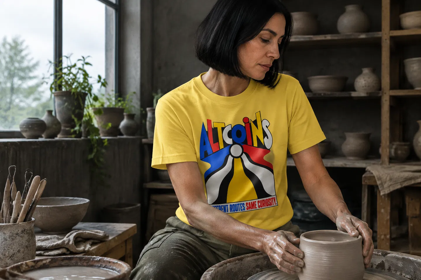
When judging two product images, keep the viewing conditions as consistent as you can. Use the same screen, avoid changing its brightness halfway through and compare similar views of the garment. A close crop of one print and a distant photograph of another make different information available. They are a poor basis for deciding which colour relationship you prefer.
Photography, lighting and screen settings can affect how a colour appears. Treat a product photograph as useful evidence of the relationship between garment and print, without assuming it guarantees an exact match to a colour already in your wardrobe. If your intended outfit depends on two shades being almost identical, that uncertainty deserves more weight than it would in a deliberately contrasting combination.
When trying on a tee you already own, compare it in daylight and in the indoor setting where you expect to wear it. Keep the rest of the outfit unchanged at first. Then change one surrounding item. This separates your response to the tee’s own combination from your response to the outfit, and makes it easier to identify what you actually want to adjust.
7. Decide how much attention you want
Return to the opening question with a more precise vocabulary. You may want a clearly readable message, a graphic that works mainly as a shape, or a quieter relationship between artwork and garment. Those preferences can change with the occasion. An outfit for an afternoon out may have a different centre of attention from one worn beneath a jacket at an evening gathering.
For our ALTCOINS tee, the decision might begin with how visibly you want to wear the reference to curiosity. For the Bitcoin V-neck, it might begin with how much presence you want the title’s fast-moving premise to have. Use the actual product imagery to judge the available presentation. There is no need to imagine unlisted colour variants to make either decision meaningful.
A useful final check is to name the thing you like in plain language: the words are easy to read; the background makes the shape clear; the print sits comfortably beside your trousers. If you can identify the relationship that works, you have a reason to choose it. That is more dependable than assigning a fixed personality to a colour.
Leave room for your own reading
FIT’s exhibition places emotional responses to colour alongside differences in cultural meaning. Our application to the graphic tee is modest: pay attention to context before deciding what a combination communicates. The artwork, its background and the clothes around it all contribute to what you see.
A successful choice can be conspicuous or understated. What matters is that the part you care about survives the move from graphic to garment to outfit. Start with that detail, check its surroundings, and let your own response settle the rest.