Culture
Bitcoin graphic tee design: Beyond the Logo
Explore Bitcoin graphic tee design through line, contrast and storytelling, with lessons from block prints and practical ways to choose a tee.
In this story
A Bitcoin tee can identify an interest immediately. Whether it gives you anything else to look at depends on its composition, its words and how comfortably those elements share the space. Start with the message: would you still enjoy wearing it once the recognition has worn off?
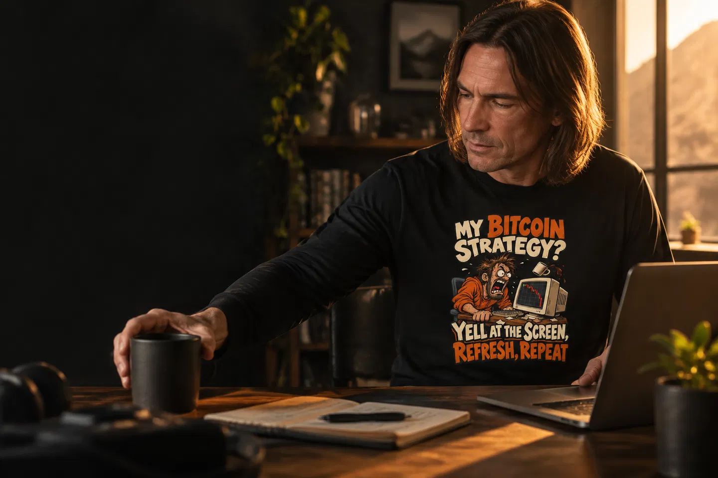
Crypto Style Tees’ “My Bitcoin Strategy? Yell at the Screen, Refresh, Repeat” offers a useful example. Its wording turns screen-bound frustration into a joke someone else can read. That gives us something more specific to discuss than allegiance to a symbol: timing, personality and the challenge of making a sentence work on clothing.
Look Beyond the Screen
Physical printmaking offers a useful way into that discussion. The curator’s event pages list Bitcoin Histórico at the National Palace in San Salvador for 11–12 November 2026. The exhibition catalogue identifies five House of Ralfus works dated 2025 as hand-carved block prints, made using oil ink on hand-dyed Bhutanese paper with an Albion press dating from around 1860. These are earlier works listed for the exhibition, rather than newly created November releases.
Those material details invite a slower kind of looking. A carved block creates an image through decisions about what remains and what is removed. Inked areas and untouched paper establish the relationship between the mark and the space around it. You can use that relationship as a starting point when looking at a graphic on a tee, without expecting the two objects to have the same texture or method of production.
Imagine examining a print from across a room, then moving closer. At a distance, you might register a broad silhouette or a strong division between light and dark. Close up, smaller marks become available. That change in viewing distance is a useful test for clothing too. A graphic has to live through passing glances as well as the longer look of someone standing beside you.
The distinction matters here: the exhibition’s documented carving and presswork belong to those artworks. They tell us nothing about how a Crypto Style Tees garment is printed. Nor does this comparison suggest a collaboration or a reason to reproduce the exhibited imagery. The useful connection is a set of questions. Where does the eye land? What remains clear at a distance? Does the surrounding space help the image breathe?
Read the Graphic’s Construction
An interesting Bitcoin graphic gives the eye a route through its content. That route might begin with a symbol, a phrase or an illustration. Our view is that the strongest choice depends on what the design is trying to communicate. A brief joke needs different pacing from an elaborate scene. More detail is only useful when it gives the viewer something worth discovering.
Line and visual weight
Line weight is the apparent thickness of a mark. Heavier marks tend to assert themselves; finer marks ask for closer attention. When viewing a product image, look for the relationship between the smallest details and the dominant elements. Can you still understand the main idea when you pull back from the screen? If you need to enlarge every part before anything makes sense, consider whether that suits how you want to wear it.
Typography deserves the same scrutiny. Lettering can carry a graphic’s whole personality, even before the sentence has been read. Without assuming any particular type treatment in our catalogue, you can ask a straightforward question of each product image: is the wording comfortable to follow? A slogan with several clauses needs a clear reading order. Your eye should not have to solve the layout before it can get to the joke.
Contrast and breathing room
Contrast is about the difference between elements: light against dark, large against small, dense against open. Strong contrast can make a focal point easy to find. Similar values can make parts of a graphic less distinct. Neither result is automatically wrong. The practical question is whether the treatment supports the message and whether you like the amount of attention it asks for.
Negative space is the area around and between the marks. On a tee, the visible garment around the graphic also becomes part of the composition. Look at the gaps between words, the space inside letters and the distance between separate elements. Empty space can give a sentence room to land. A densely packed design may suit your taste, but density should still feel deliberate rather than difficult to untangle.
A story worth wearing
The catalogue gives us two distinct starting points for storytelling. The My Bitcoin Strategy? Yell at the Screen, Refresh, Repeat Long Sleeve T-shirt is built around a comic routine. Read aloud, the wording has an escalating rhythm, followed by the return implied by “Repeat”. You can judge whether the displayed artwork gives that rhythm an equally clear visual reading.
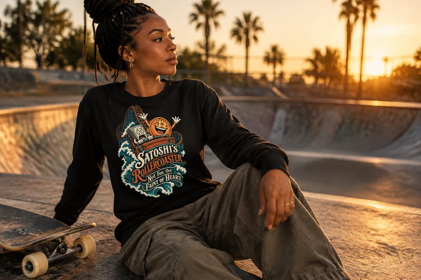
The Satoshi’s Rollercoaster Not for the Faint of Heart Long Sleeve T-shirt uses a different verbal device. Its title turns volatility into a familiar fairground metaphor. That observation concerns the words, not a claim that the artwork depicts a particular ride. One message finds humour in a repeated action; the other invites recognition through an image expressed in language. Choosing between them begins with which voice feels closer to yours. For another design to compare, look at Block by Block and see which details catch your eye first.
This is where Bitcoin graphic tee design becomes more interesting than a recognition test. A familiar subject can support dry humour, exaggeration or a more reserved treatment. For us, the useful measure is whether the particular design earns a second look. A recognisable reference gets someone to the doorway. The wording and composition determine whether there is much to stay for.
Make Room in the Outfit

A product image isolates a graphic so you can study it. An outfit introduces other edges, colours and interruptions. An open overshirt may frame the centre of a tee while covering its sides. A jacket can leave only part of a sentence visible. Before choosing a graphic for regular layering, think about where its essential information sits and whether your usual outer layer would obscure it.
For a sentence-led design such as “My Bitcoin Strategy?”, we would start with uncomplicated trousers and leave the wording visible. Straight dark jeans and a plain open jacket are one possible combination. This is a styling preference, not a rule: it gives a long message fewer competing details. If the joke is what you enjoy, there is little point arranging the outfit so that only its middle clause can be seen.
The rollercoaster slogan offers a more theatrical verbal mood. You could keep the rest of the outfit restrained and let that wording supply the energy. Equally, if your wardrobe already includes expressive accessories or strong colour, check how the whole outfit reads together. The aim is to decide what leads. Several attention-grabbing elements can work, provided you enjoy the conversation between them rather than feeling dressed around a piece you cannot settle.
Neckline is another part of that frame. The same “My Bitcoin Strategy?” wording is also listed as a V-neck T-shirt, giving a reader a garment-shape choice as well as a message choice. Compare the actual product images rather than assuming a change of neckline will leave the overall impression identical. The outline of the garment, the visible area above the graphic and your preferred layers all affect what you see.
Distance matters in the mirror as much as it does on a screen. If you already own a graphic tee, stand far enough back to see the whole outfit before moving closer to inspect the print. Notice what catches your eye first. That small exercise can clarify your preferences when browsing: perhaps you favour a strong central statement, or perhaps you prefer a quieter graphic that only becomes legible in conversation.
There is also the social question of the message itself. A slogan about yelling at a screen makes frustration available as humour. “Not for the Faint of Heart” takes a more dramatic tone. Neither needs to describe your behaviour or make a claim about your finances. Still, words on clothing speak before you do. Choose a joke or reference you are happy to repeat in public, including when somebody asks what it means.
Choose the Second Look
The lesson we take from the documented block prints is the value of attending to construction. Look at a graphic’s strongest mark, then its quieter spaces. Read the words in order. Step back and see what survives. Those checks are useful whether your taste runs towards a long slogan or a simpler statement.
For our tees, the choice starts with a message you want to wear and continues with how that message occupies the garment. Recognition may happen instantly. A well-chosen graphic should still give you something to enjoy after that first glance.